We start with clicking on an empty space on a page where we want the slider to be placed. Sliders can, the same as buttons, stretch over multiple grid cells on your page. We will add the slider on the space next to the button we already have on this page.
This will open the known edit page for you control. This opens by default as a button but we can change that to a slider. Currently the selector is set on a button, but if you click on it you can select a Slider.
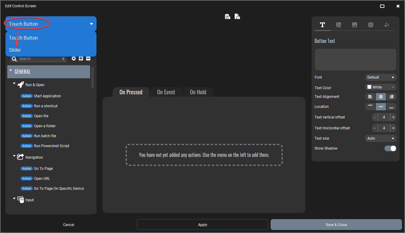
This will change the whole screen into the Slider edit screen. All options on this page will be for your Slider.
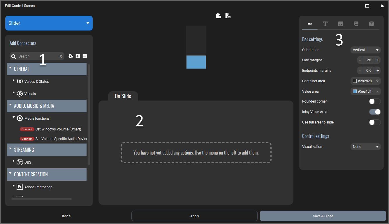
The Slider edit screen looks similar to the button edit screen. Lets get into the section:
With buttons we could add all sorts of actions to a button which were executed when for example the button was pressed. Sliders are quite different and they need to be connected to a specific control or value in a specific software application. Hence the name of these new entities: Connectors. The list will show all available connectors that you can use.
Similar as with buttons you can select a Connector from the list on the left and they will be added to the list of attached connectors. When you use the Slider they will send the percentual value of the slider position to the connectors attached and they will send the new value to the control or value it is connected to.
You cannot reorder this list as it has no function. All connectors will be called upon whenever the slider is used.
In this panel you can customize your slider with a lot of options. More on this later.
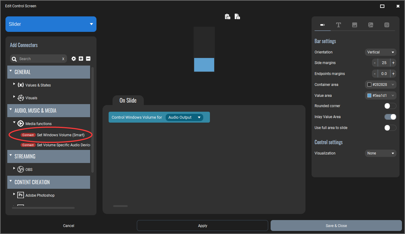
From the Connectors list, select the Windows Audio as shown on the image. When you do this, that Connector will be added in the list of attached Connectors. From this moment when using the slider, it will control the windows audio output.
Although we have a functional Slider already, we want to make it a bit visual attractive as well. We have changed the following settings:
| In the first tab of the Slider settings you will find all options regarding the slider bar. We have changed the colors and we made the side margins a bit bigger. This results in a smaller slider bar. Because we do not want our Slider to reach the full ends of the cell, we also added a bit of endpoint margin. This will position the Slider in the cell but will leave a bit of space on top and below. We also made the bar have rounded corners and we added a control object. In this case a colored circle. The colored circle will automatically have a size related to the width of the bar itself. In some ocassions this may not be optimal so play around with it a bit to fit what you like. | 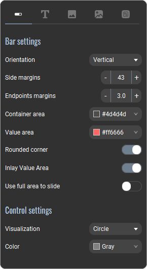 |
| We also added a label to the Slider. We put it below the Slider bar. | 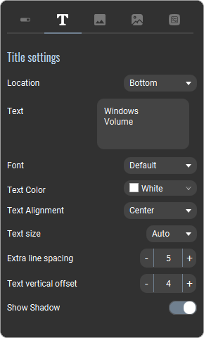 |
| And finally we have made the space the Slider takes on the Page a bit bigger so it fills the current page. We made it 2 rows bigs. | 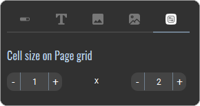 |
In this tutorial we will not change the background of the Slider nor do we add an icon. Play around with that yourself and learn more about it. Backgrounds work the same way as they do with buttons.
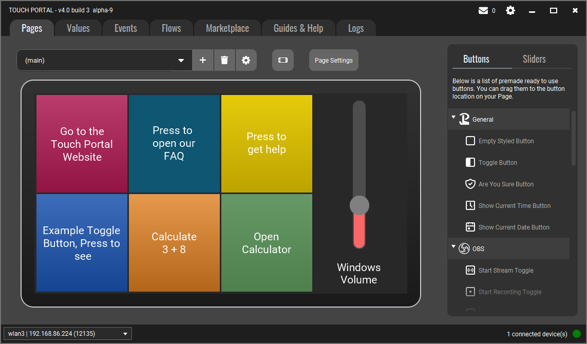
Your Slider will now look like this.
Now put up some music on your Windows and control the volume with this Slider!